


Responsive Design: Why Your Business Needs a Mobile-First Strategy
The Importance of Responsive Design in Today’s Digital World
In a global marketplace where user experience defines brand loyalty, responsive design is no longer optional—it’s a necessity. A website that adapts to any screen size not only delivers a better experience but also builds trust, improves SEO, and drives conversions. Whether your target audience is local or international, a mobile-first strategy ensures your digital presence performs optimally across all devices.
At Dimark USA, we specialize in creating adaptive digital solutions that go beyond aesthetics. This article will explore the key benefits of responsive design, its business implications, and why investing in it is one of the smartest moves you can make in today’s connected economy.
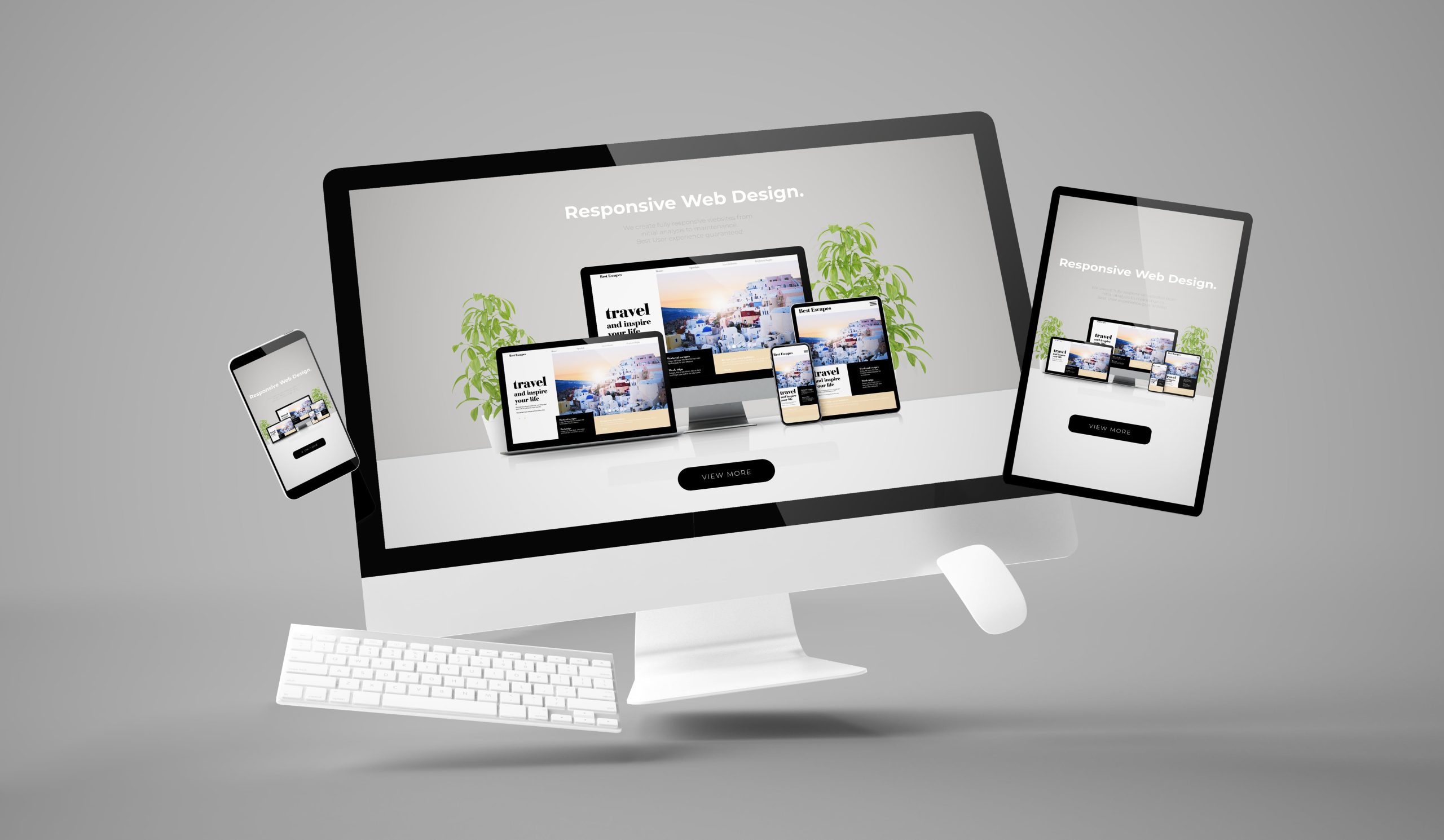
What Is Responsive Design?
Responsive design refers to the practice of building websites that automatically adjust their layout, content, and functionality based on the screen size and orientation of the user’s device. This includes:
- Smartphones
- Tablets
- Laptops
- Desktops
- Even smart TVs
Unlike fixed or adaptive designs, responsive websites use flexible grids, fluid images, and media queries to deliver an optimal browsing experience regardless of the device.
Key Features of Responsive Design
- Fluid Grids: Flexible layouts that adjust to screen width.
- Flexible Images: Images scale proportionally within containers.
- Media Queries: CSS rules that adapt design elements based on device characteristics.
- Consistent User Experience: Uniform functionality and design across all platforms.
Why Responsive Design Matters for Your Business
1. Enhanced User Experience
Today’s consumers expect seamless interaction with your website, whether they are browsing on a phone or a desktop. A responsive website ensures visitors can navigate your site easily, read content without zooming, and complete actions like filling out a form or making a purchase without frustration.
2. Improved SEO Performance
Google has made mobile-friendliness a key ranking factor. Responsive design improves:
- Page load speed
- Mobile usability scores
- Bounce rate reduction
These factors collectively enhance your search engine visibility and organic traffic.
3. Lower Maintenance Costs
Maintaining a single responsive website is more cost-effective than managing separate versions for desktop and mobile. Updates and content changes only need to be made once, reducing labor and time investments.
4. Increased Conversions and Sales
Websites that are easy to use convert better. By removing barriers like awkward navigation or inaccessible forms on mobile, responsive design can significantly increase your conversion rates.
5. Broader Audience Reach
With global internet access predominantly via mobile devices, responsive design ensures your website is accessible to users around the world, expanding your market and enhancing your international business footprint.
The Role of Responsive Design in a Transnational Strategy
In an interconnected global economy, responsive design isn’t just about usability—it’s about inclusivity and reach. Businesses with an international client base must ensure their digital platforms perform seamlessly across regions.
Transnational Benefits of Responsive Design
- Localized UX: Adapt content based on language and cultural preferences.
- Device Compatibility: Account for varied device usage trends across countries.
- Faster Load Times: Essential for markets with slower internet speeds.
- Consistent Branding: Maintain your brand identity across borders.
By incorporating these elements, companies can increase customer satisfaction and strengthen their global digital presence.
Best Practices for Responsive Web Design
To make the most of responsive design, it’s essential to follow industry best practices:
✅ Mobile-First Approach
Start designing for the smallest screen and scale up. This ensures the most critical functions are prioritized.
✅ Optimize Navigation
Use clear and intuitive navigation menus that are easy to interact with on touchscreens.
✅ Compress Media
Optimize images and videos for faster loading without compromising quality.
✅ Use Scalable Typography
Font sizes should adjust based on screen size to enhance readability.
✅ Test Across Devices
Regularly test your website on various devices and browsers to identify issues and optimize accordingly.
Why Choose Dimark USA for Responsive Web Design?
At Dimark USA, we don’t just build websites; we craft responsive experiences that resonate with users and convert visitors into customers.
Our Services Include:
- Custom mobile-first web design
- UX/UI optimization for all screen sizes
- SEO-enhanced architecture
- Multilingual and culturally adaptive interfaces
- Ongoing maintenance and analytics
Our team works with clients across North America, Latin America, and Europe, tailoring solutions that meet the demands of diverse audiences.
Take the Next Step Toward a Smarter Digital Presence
Ready to future-proof your website and make it accessible to a broader, global audience?
✉️ Contact Dimark USA today for a personalized consultation and discover how responsive design can transform your online presence.
🌐 Visit: https://groupdimark.us
Build a website that adapts, engages, and converts — with Dimark USA.